Toby etc. is a bespoke design and strategy company proving services for niche international brands .
An established clothing designer and emerging brand strategist, Toby Clark leads unique projects for international brands, working alongside respected opinion formers. Toby believes in creating things slowly with crafted care. Championing a commitment to quality that is underlined with a sense of purpose.
The studio is guided by uberrima fides, a latin term meaning ‘of utmost good faith’. Honesty and integrity are common values in authentic brands and this can be developed into strategic armoury when building the brand culture and brand reputation.
Toby’s intrinsic approach avoids cutting corners or favouring cheaper solutions, seeing little value in such a methodology. Instead he carries out detailed observation, with wide reaching research for all projects. This commitment has enabled him to work closely alongside his brand clients, creating beautifully crafted products that attract loyal and discerning followers.
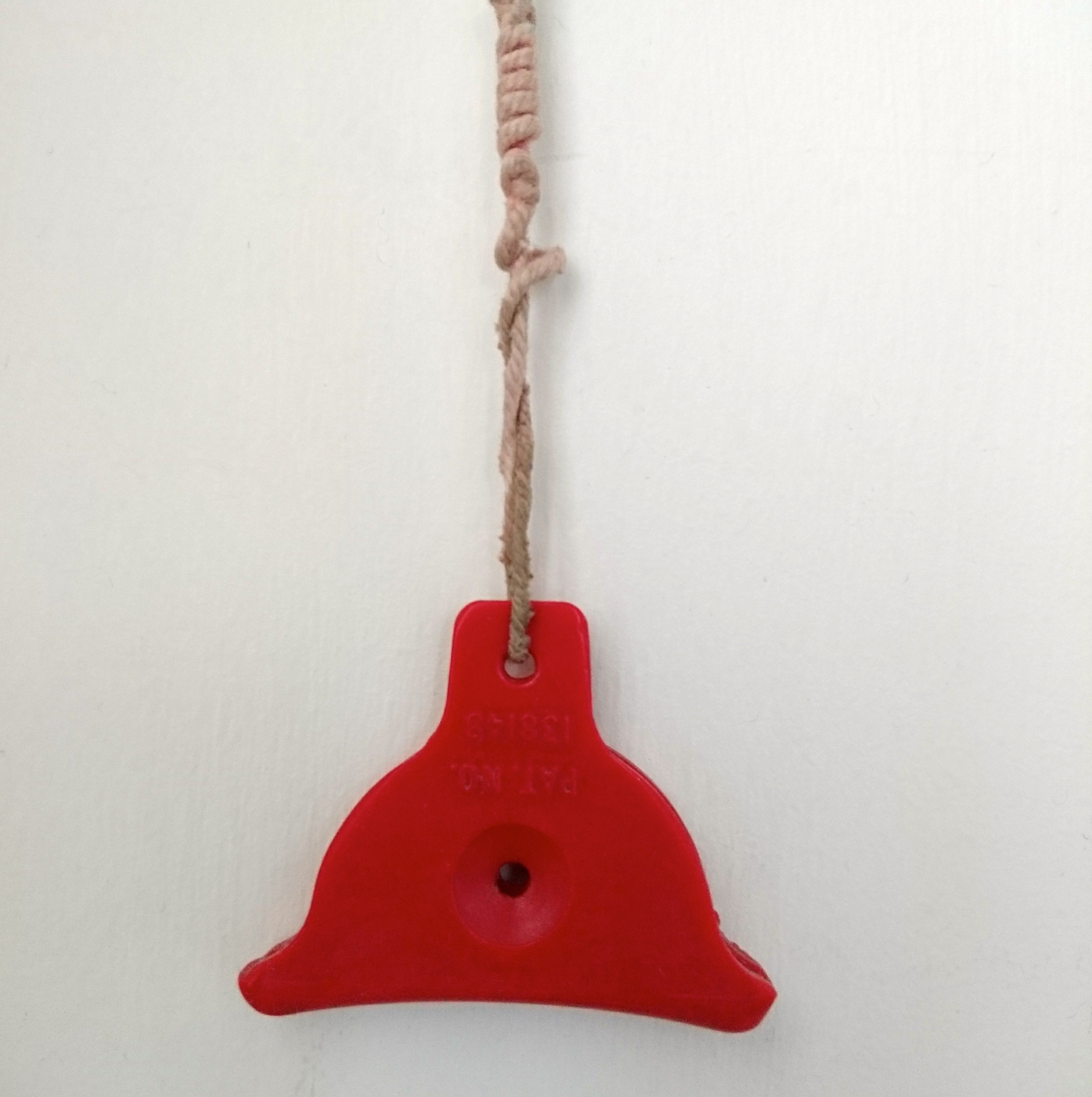
Toby uses his vintage red plastic sheepdog whistle as a meaningful symbol to represent the ethos and identity for Toby etc.
“My red sheepdog whistle was given to me in 1978 by my grandfather Jack Ramsden, a respected farmer and champion sheepdog trialer in New Zealand.
He taught my brother and I how to blow these whistles, while ‘Star’ his champion sheepdog, tracked a flock of sheep on the distant hilltops. The skill, coordination and loyalty between man and dog blew our young minds. I particularly love how such a small instrument can send detailed instructions to an attentive, loyal working sheepdog from far away and how this process represents a lifetime’s skill and knowledge.”
When conceiving the brand identity for ‘Toby etc.’, Toby chose to collaborate with a true craftsman of letterforms and logotype. Mr Smith’s Letterpress in Kennington, London is run by the talented Kelvyn Laurence Smith.
~~~
“I first encountered Kelvyn operating a letterpress at The New Craftsmen exhibition in Somerset House. He was printing alliteration art, with a mug of coffee in hand while whistling a tune. He looked to be an artist in his flow and I felt intrigued by his approach to font, type and letterforms. It seemed to be the embodiment of a contemporary, artisanal, master-craftsmen.
For my own branding I wanted to commission a true practitioner of three-dimensional letterforms, with a real ‘hands-on’ approach to the subject. As in a traditional foundry and rather than appointing a digital brand studio. I often find 21st century creatives are reliant on their flat digital screens. Kelvyn proved to be the perfect foil to this thinking.
‘Toby etc.’ is personified by a personal touch, the design identity conceived with a certain Britishness and sense of simplicity. The size and position of the full-stop after ‘etc.’ was pondered over for some time while nourished with strong coffee and homemade brownies. Kelvyn prepared a small collection of beautifully rendered test prints on tactile papers and Clarendon was chosen as the suitable logotype.
This particular font was created by Robert Besley in London in 1845 at Fann Street Foundry. It was the world’s first patented typeface and became popular in many parts of the world, especially in display applications such as posters, printed with wooden type.
The brand identity for ‘Toby etc’ also included this website which Kelvyn Smith conceived as a simple grid of squares to function intuitively for the end user.”